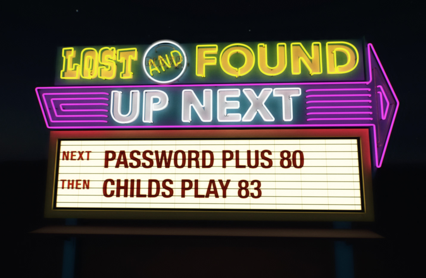
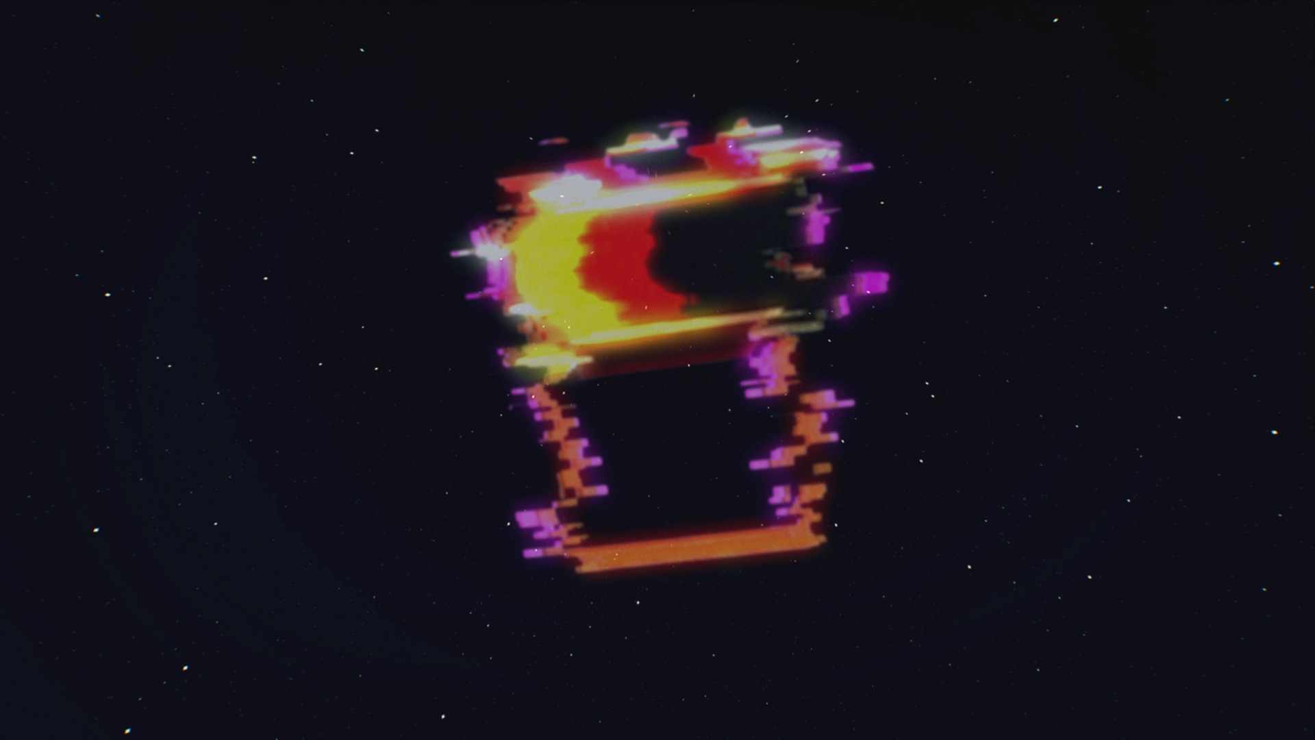
Lost and Found is a programming stunt that runs annually on Buzzr TV. [What is a stunt, you might ask? Well, it’s a block of shows, pre-empting regular programming, that runs for a short time (a few hours, a day, or throughout a week, usually). It’s an opportunity to curate a collection of episodes on a specific theme, or to show programs that aren’t in regular rotation.] With the Lost and Found stunt, Buzzr can create a special event in the schedule by airing rare shows, pilots, and episodes.
I was responsible for the visual direction and animation of the project. We needed to find a way to package a collection of episodes from different shows that hadn’t seen the light of day in decades. The concept we developed for the packaging centered around an old, abandoned, slightly spooky drive-in theater in the desert that was showing long-forgotten episodes. This felt like a good fit for a number of reasons:
• Though there are still a few functioning drive-ins, they are generally associated with a bygone era (the era most of our shows are from).
• Abandoned drive-ins still pepper the American landscape, and flipping on the lights on these neon signs evokes this idea of bringing something back to life that has been gone for a long time.
• Drive-ins curated their own programming, similar to what we were doing with our stunt.
• It was also helpful that this motif had a built in visual language (marquees) that translated well to creating assets that required several versions, like menus and tune in pages.
Logo explorations
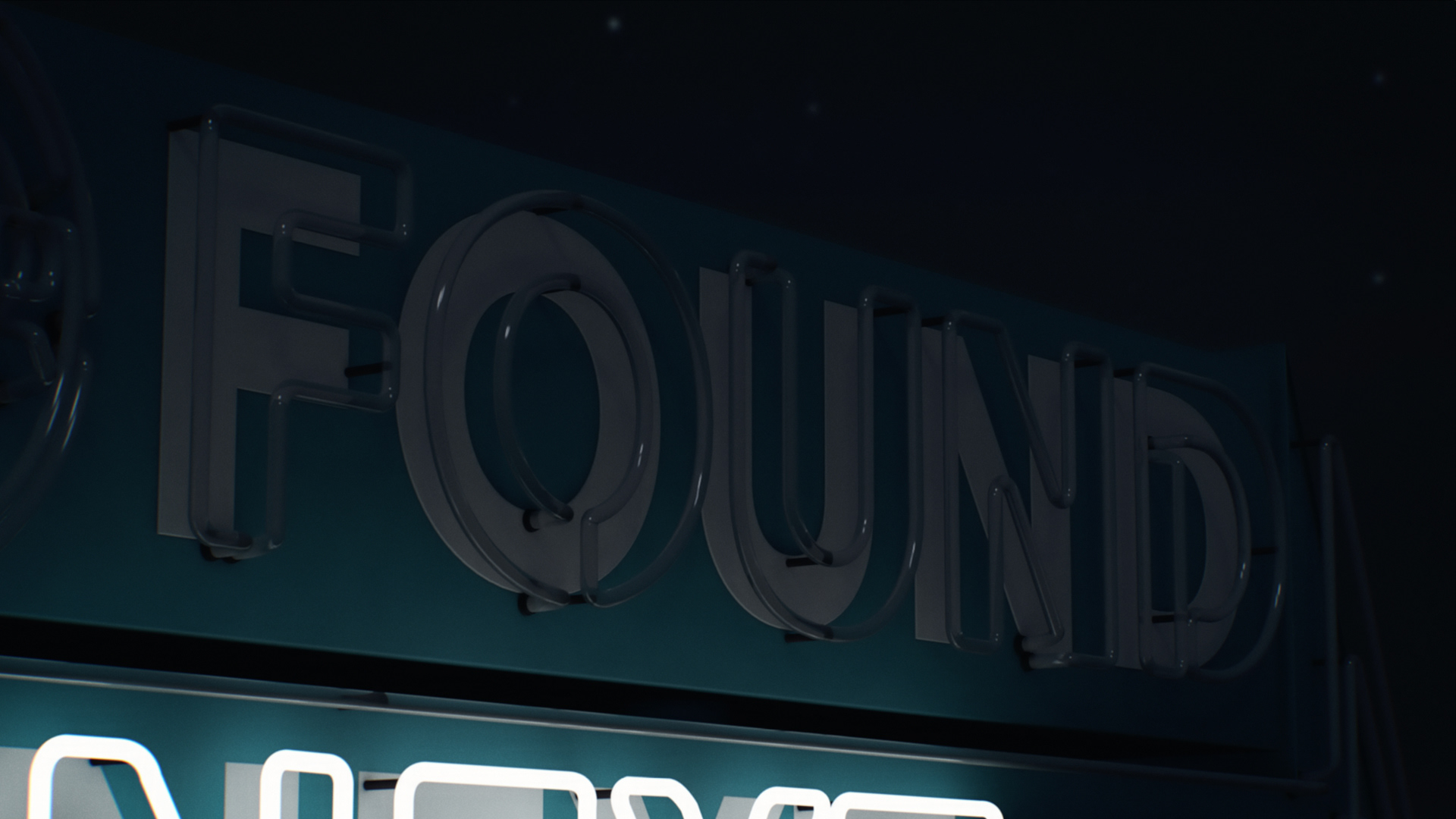
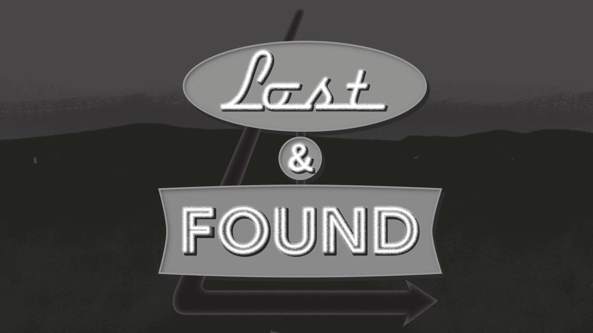
The concept we developed for the packaging centered around an old, abandoned, slightly spooky drive-in theater in the desert that was showing long-forgotten episodes. At this point, we knew that we wanted a neon sign to function as the logo, and the original idea was that there would be POV shot of someone pulling up to a sign in the desert that would light up. These are a few images from my early explorations.
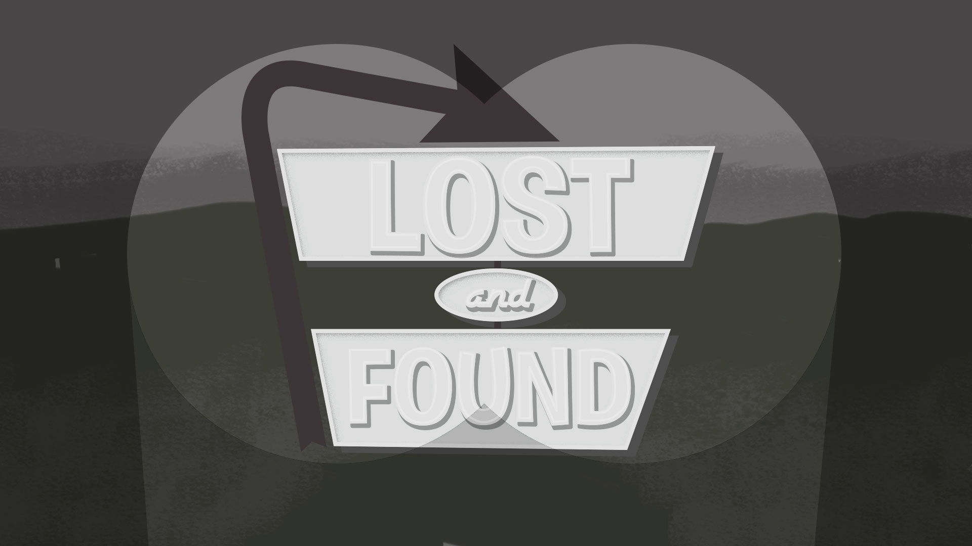
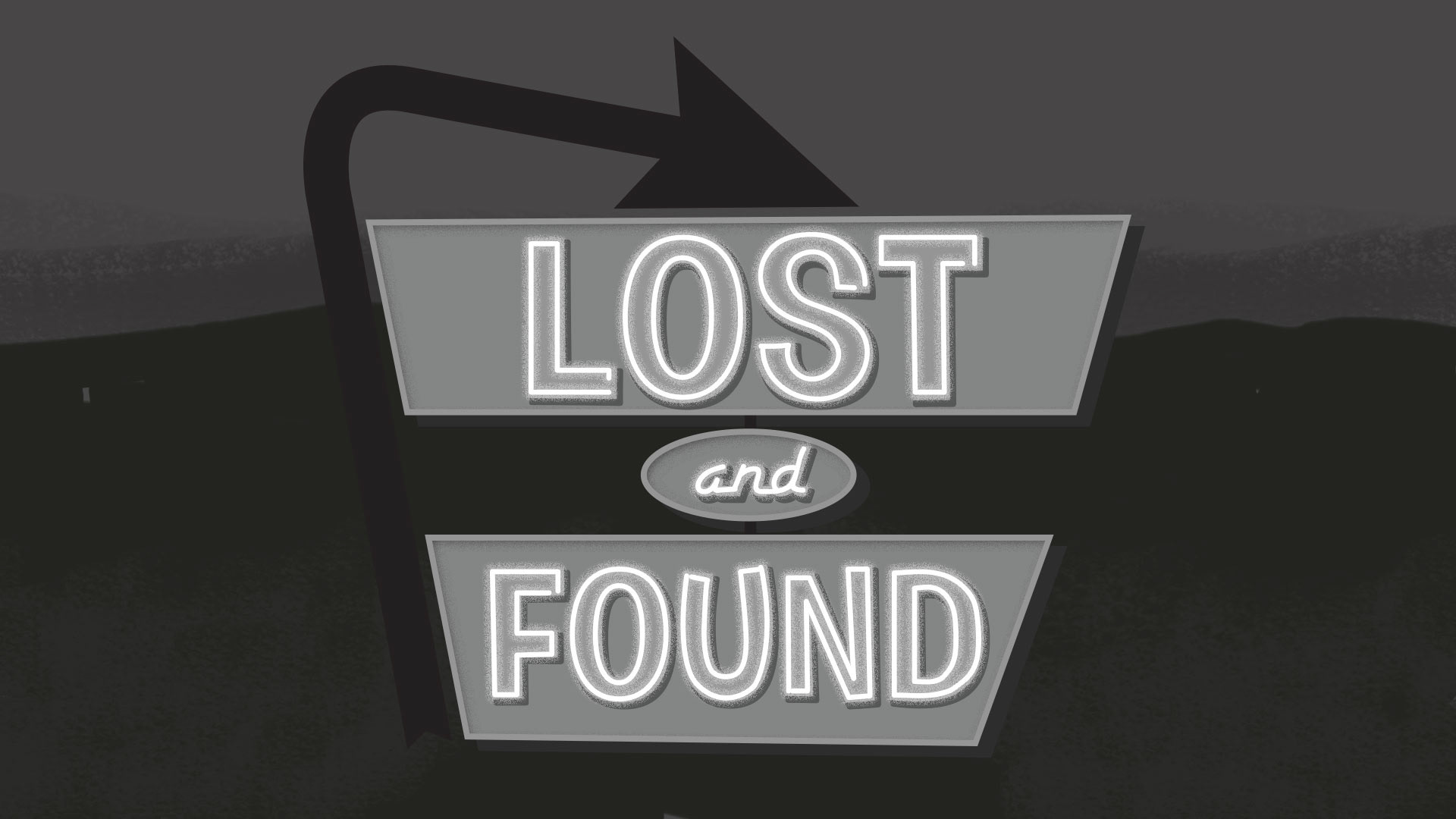
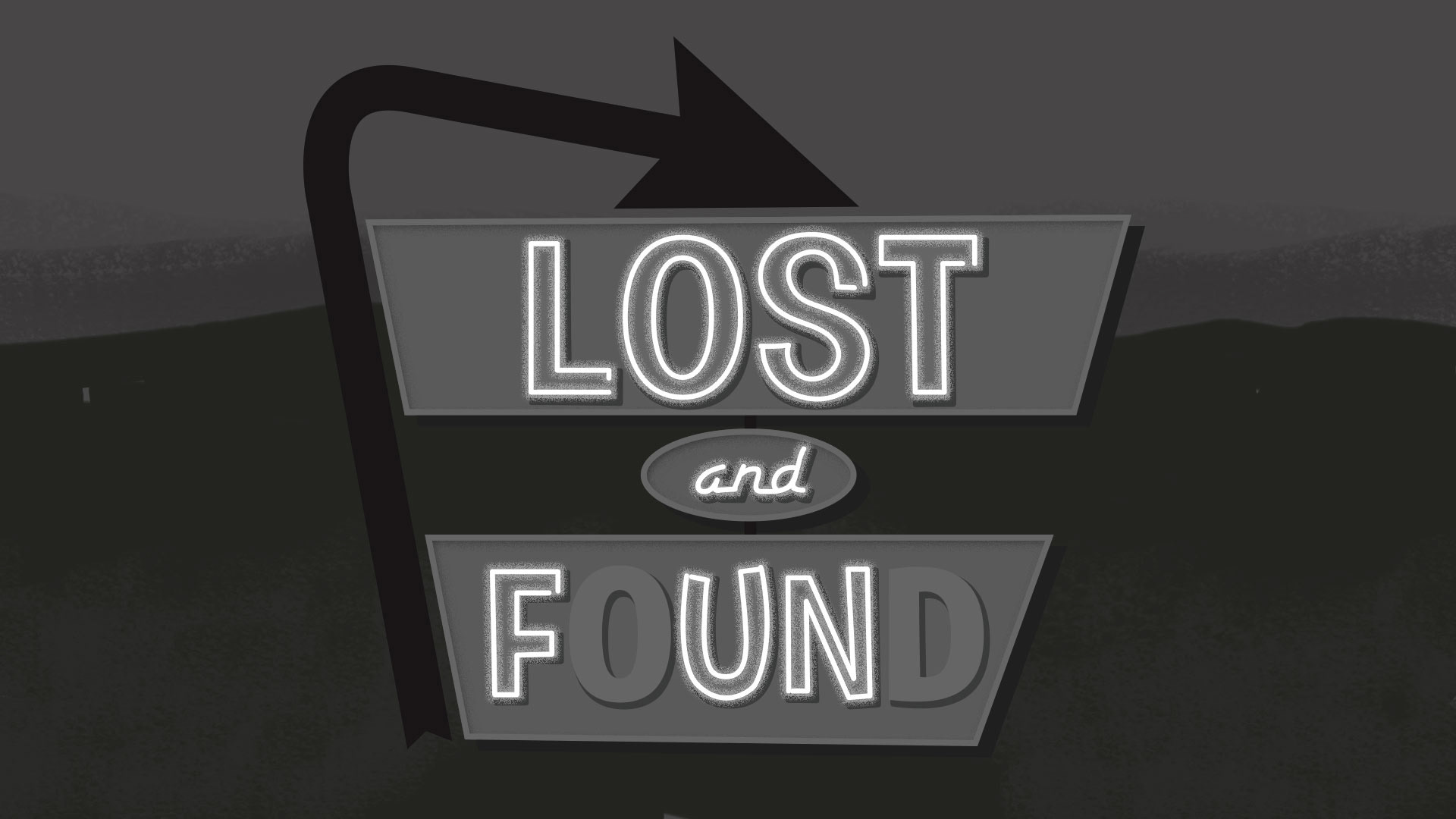

Storyboards
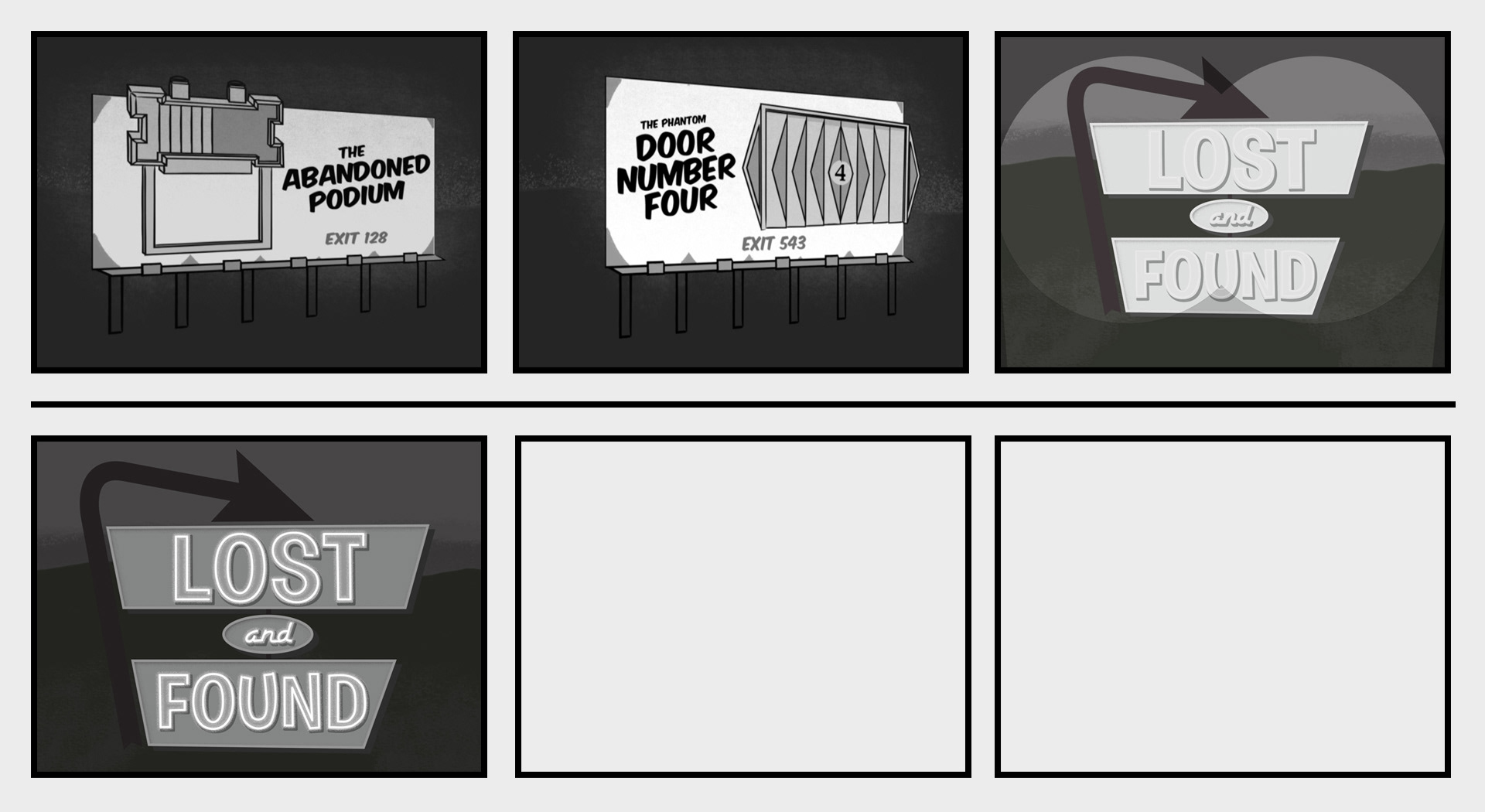
The concept was expanded further to include a POV shot of a drive down a rural highway at night, passing by billboards for mysterious roadside attractions that were pulled from shows we were airing. We eventually ended up pursuing a more Twilight Zone-style opening with the objects floating over a star field, which can be seen in the final spot.
Sign/logo design
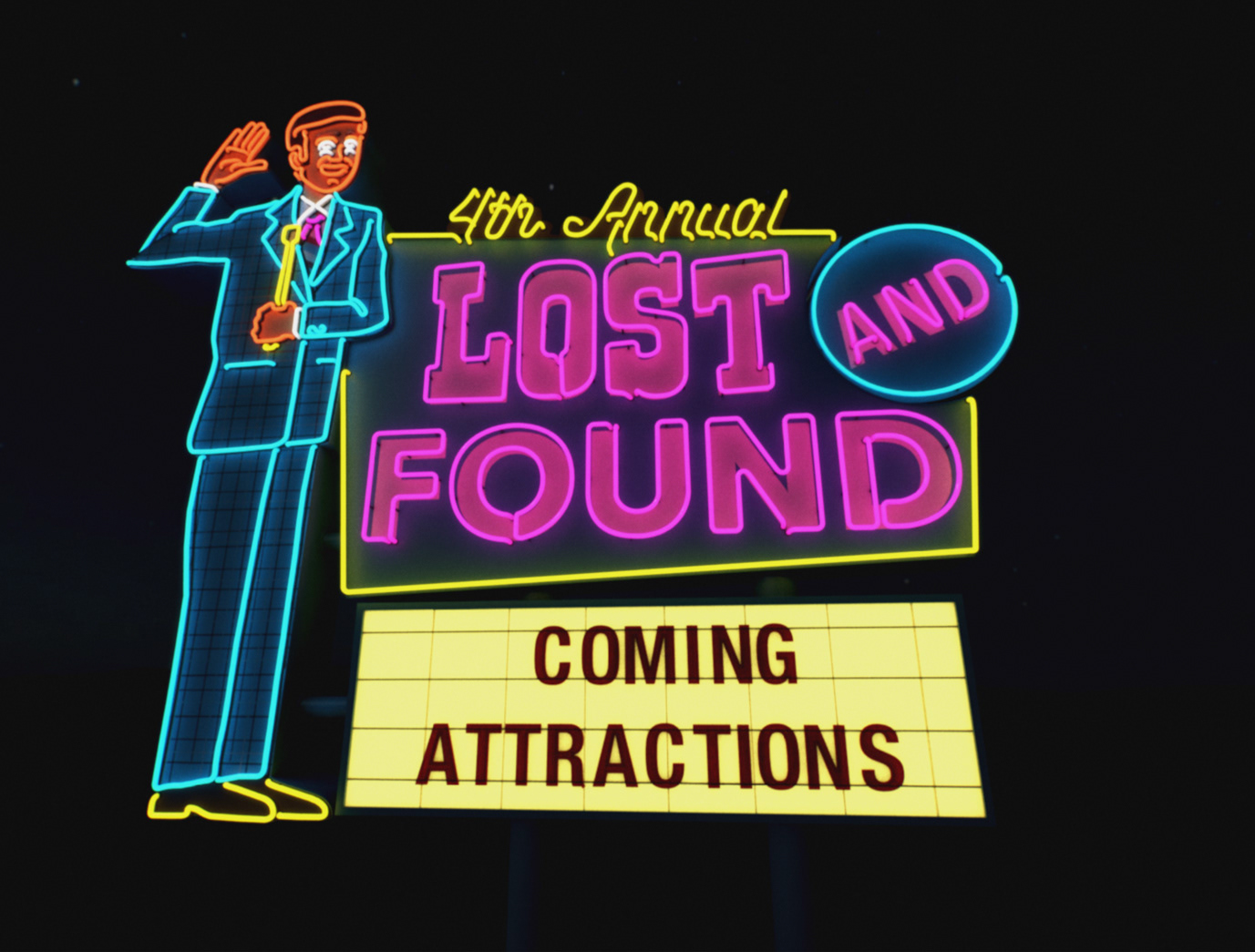
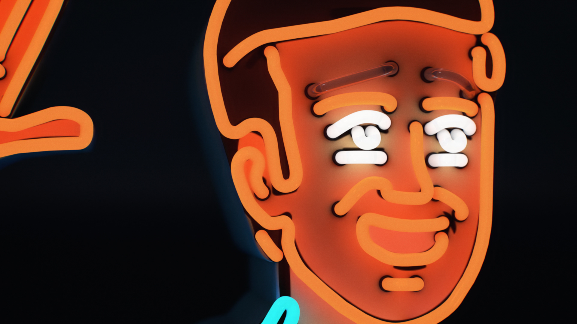
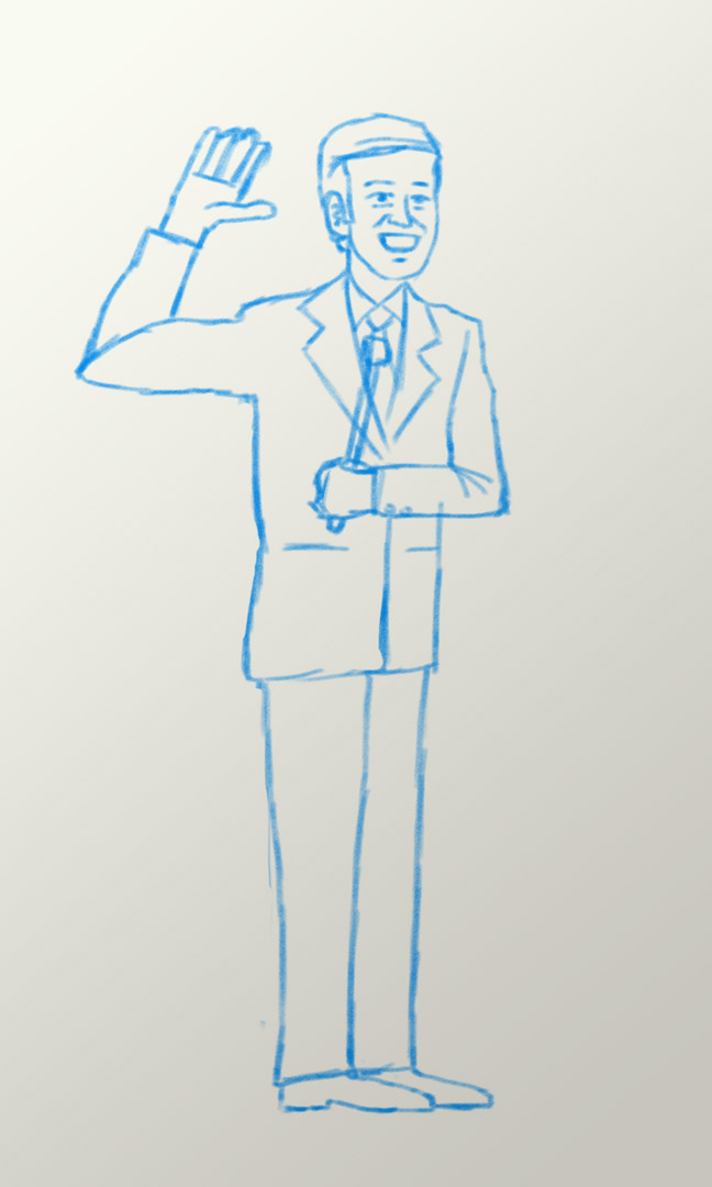
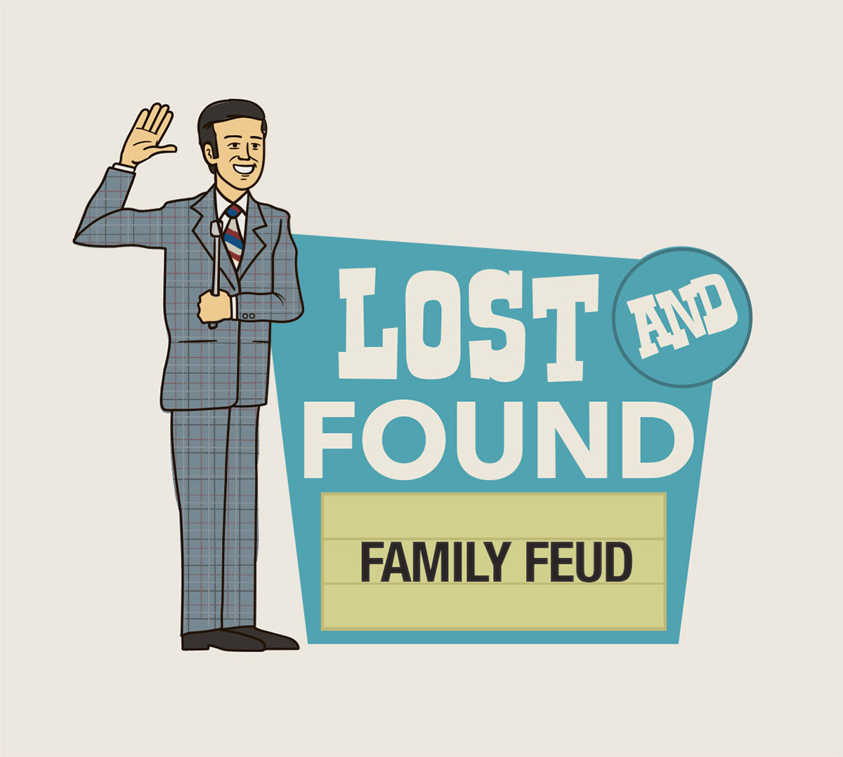
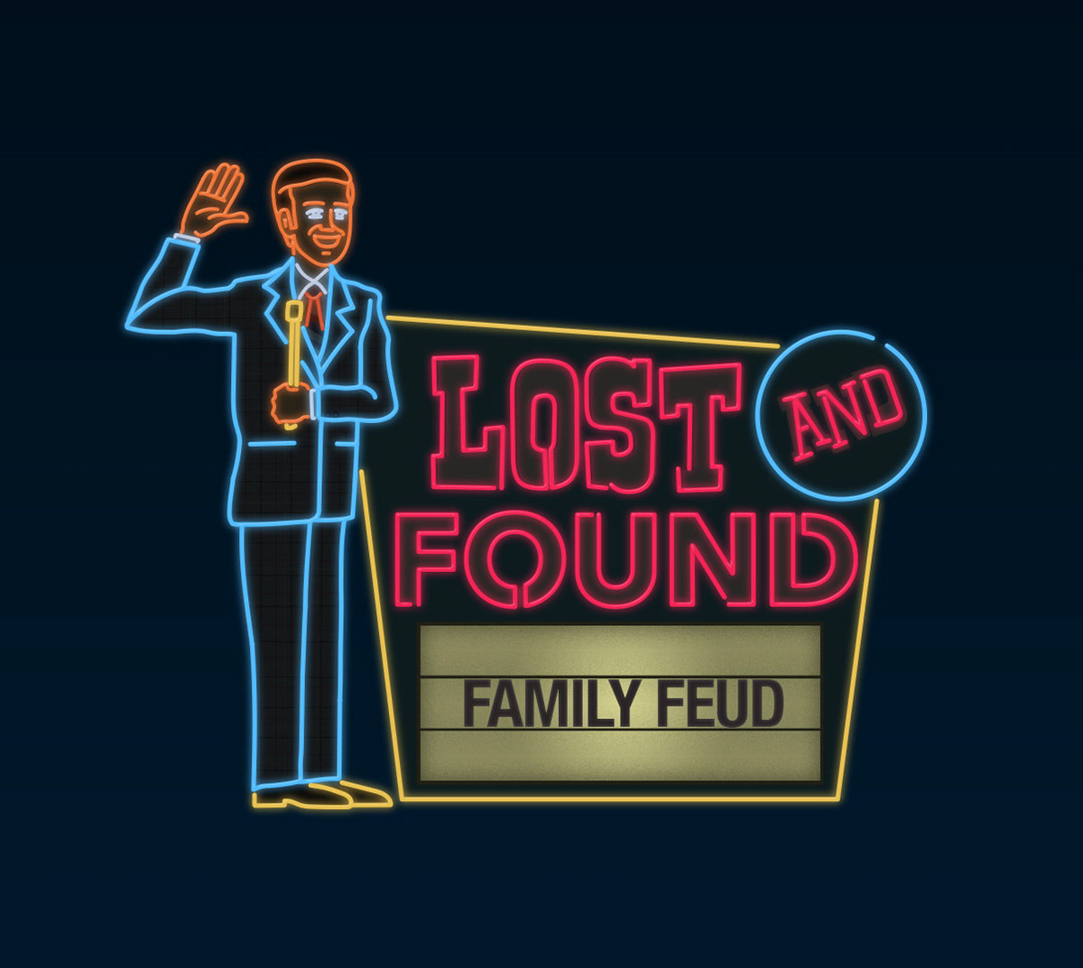
Inspired by some of the more grand roadside and casino signs, I added a game show host character to the sign in an effort to add more personality. It also had the added benefit of introducing some more motion with the waving hand. The addition of the marquee made the sign more flexible for tune-ins and social media posts and ads.
What started as a one-off stunt, turned into an annual event that has run for six years. It is one of the most popular event’s in Buzzr’s calendar and consistently attracts sponsors.
I worked in Cinema 4D (modeling and animation) to create the on-air elements--graphics for the promos, menus that ran during the stunt, and lower thirds.
Client: Fremantle Media / Buzzr
Role: Art Direction/Animation/Design
Role: Art Direction/Animation/Design
